Nike officially released all 30 of the new NBA City Edition jerseys today on their website, in another attempt to further differentiate what it means to be the official sponsor of NBA jerseys. This is the fourth jersey category released by Nike (following Icon, Statement, and Association editions).
“The Nike NBA City Edition uniforms represent insights and emotion from the court to the upper deck to the cities’ streets, in pursuit of a unique way to capture each team and its city in a way that respects the past and present of the clubs while also positioning them for the future.”
Other than the rampant ripping going on at the beginning of the season, Nike has done a really good job with the alternate jerseys and it's refreshing to see this wasn't just an oppouritunity to slap a checkmark across all 30 teams.
The integration of "stories" built into each jersey's design and concept adds for a wide range of pretty dope looking jerseys to just plain bad. No matter the explanation for why the jerseys look the way they do, below we discuss what we think of them overall.
Favorite Jersey
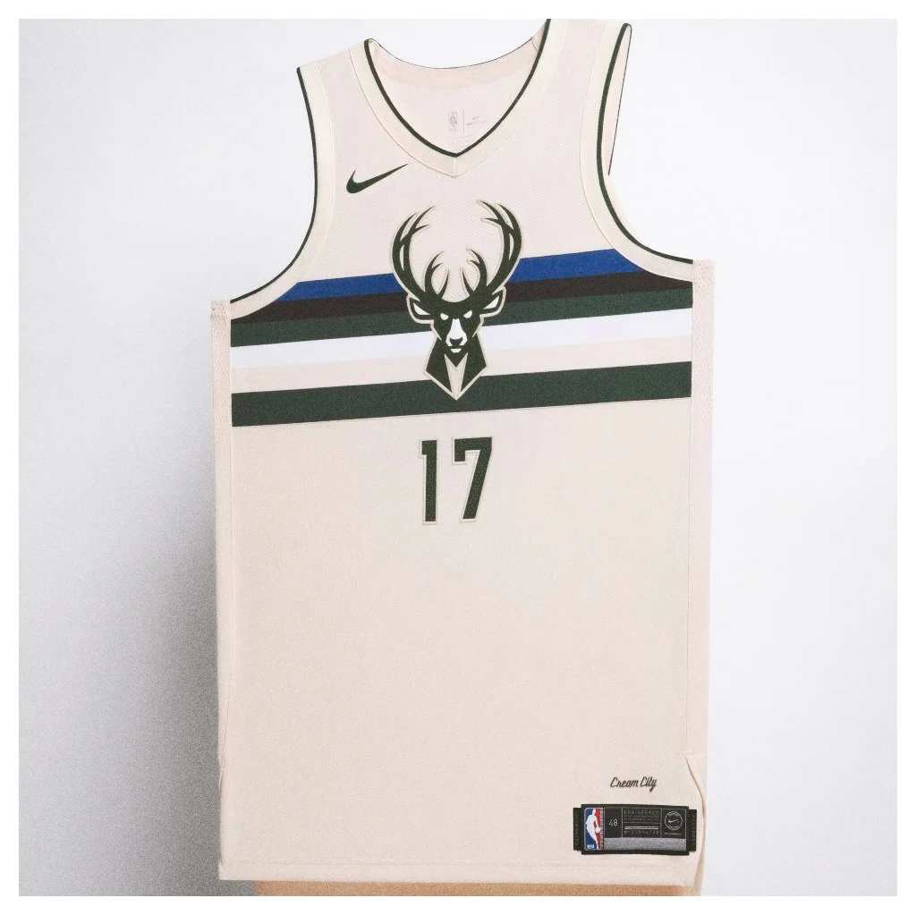
Falc: I'm going to have to lean towards the Milwaukee alternates. There's something about the cream color way that you really don't see on jerseys that's really appealing, coupled with the stripes and Buck logo. Just looks very clean, almost like a classic Pepsi can or something.
Baro: There's a few that caught my eye (CHI, WAS, PHI) but if I had to pick...gonna have to go with Milwaukee. The "cream" color scheme is perfect as the base for an alternate jersey - the green & blue are perfect accents, look really clean as stripes.
Chicago's ode to the city's flag (red, white & blue) is a close second though - the throwback lettering & stars is a perfect touch.
Jersey design you hate the most
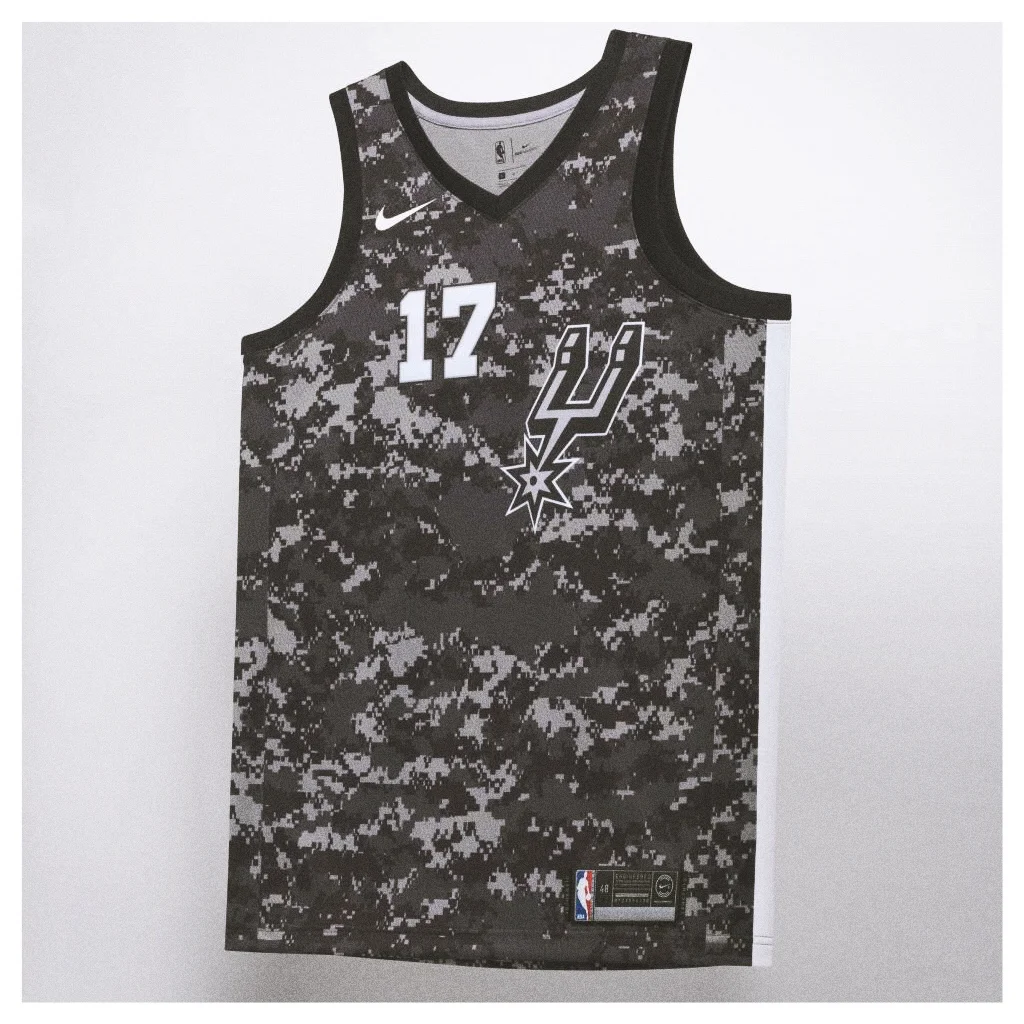
Falc: Definitely the San Antonio Spurs. I fully understand the tie-in to the military; actually as I'm writing this I'm realizing that the camouflage isn't even really an issue. It's the lack of regard for common decency with respect to alignment.
The Spurs have been unreasonably insentient on designing their jerseys with misaligned spur logos and player numbers and I absolutely wish they hire a new graphic designer or at least pay for some courses in Adobe.
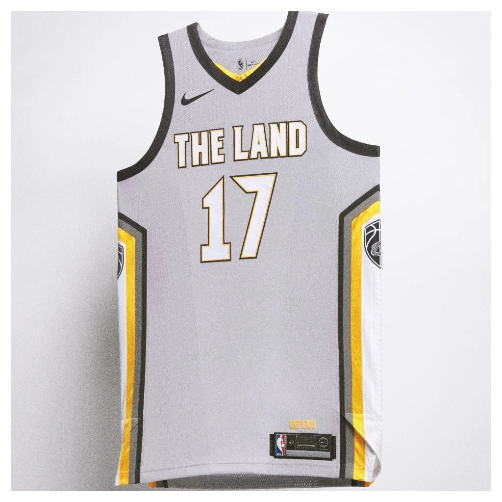
Baro: I'm really disappointed in CLE's new kits. Not even sure what they were aiming for - the grey alternate seems a little left field - dark blue or any other color would've made a difference.
Maybe it looks better in person but overall, just feels boring and doesn't really match up with their other, sleeker jerseys.
Strangest Design
Falc: I'm gonna have to go with the Cavaliers here; at a glance their alternates look like an Indiana Pacers collection. In general there's no distinct colors or features that really even hint at this being a Cleveland uniform other than the forced 'the Land' slogan LeBron tried to make stick, which clearly he's won that battle because now it's on the jersey.
Baro: UTAH! Look, I get the idea of depicting their sunset but...there's just a lot going on. Perhaps the Jazz logo or an illustration of SLC's beautiful mountains & scenery would've spiced it up a bit.
Instead, the patterns look a little weird.
Jersey you'd most likely own
Falc: Chicago's jersey for sure. My answer is probably a little biased because I'm from there, but in actuality it's just a classic looking set of threads. Also, any inclusion of the Chicago flag usually sets you up for a winning design.
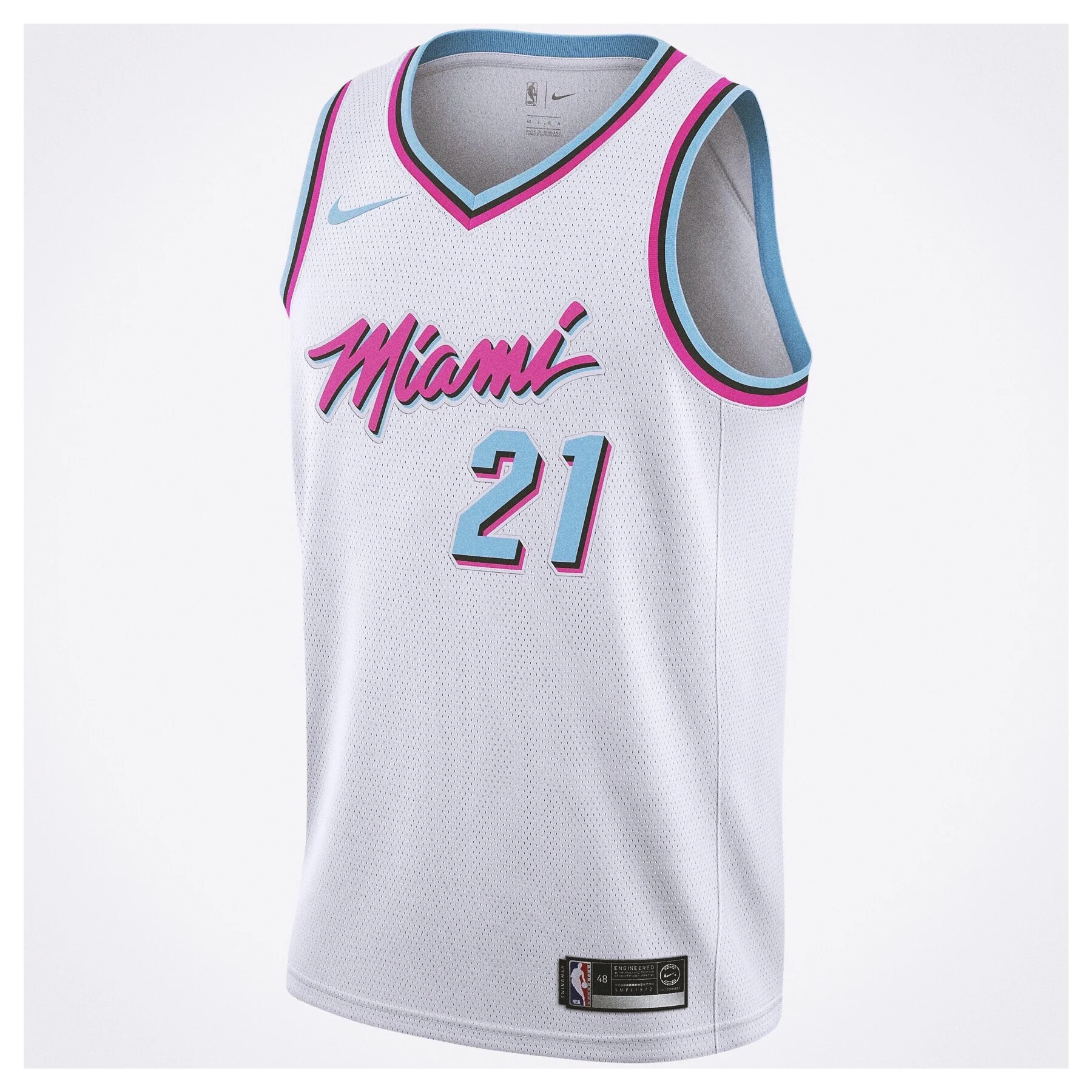
Baro: Bulls, Lakers & Miami!
CHI: Z. Lavine (#8) -- CHI's newest star, no. 8 would look great right underneath the cursive lettering, opposite the 4 stars.
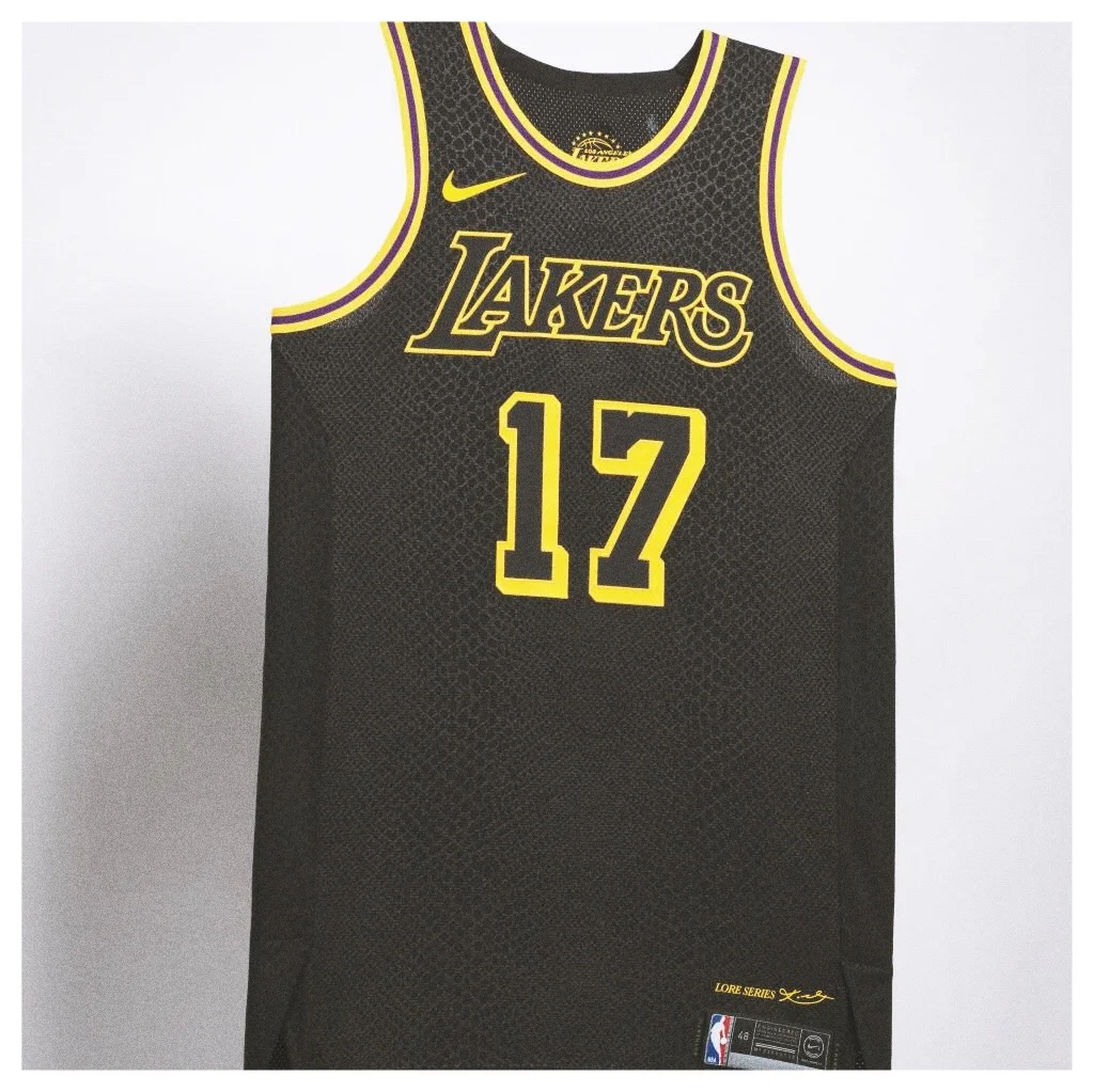
LAL: K. Kuzma (#0) -- LA's (surprising) star rookie, Kuzma's #0 will be a hot seller before long. The "Kobe" kit is creative (ft. Black Mamba scales), a perfect jersey to start a new collection.
MIA: J. Richardson (#0) -- an emerging Star UnderDOG, I'd rock J-Rich's "Miami Vice" jersey - MIA rarely misses w/ their uniforms!
Jersey with the best background story
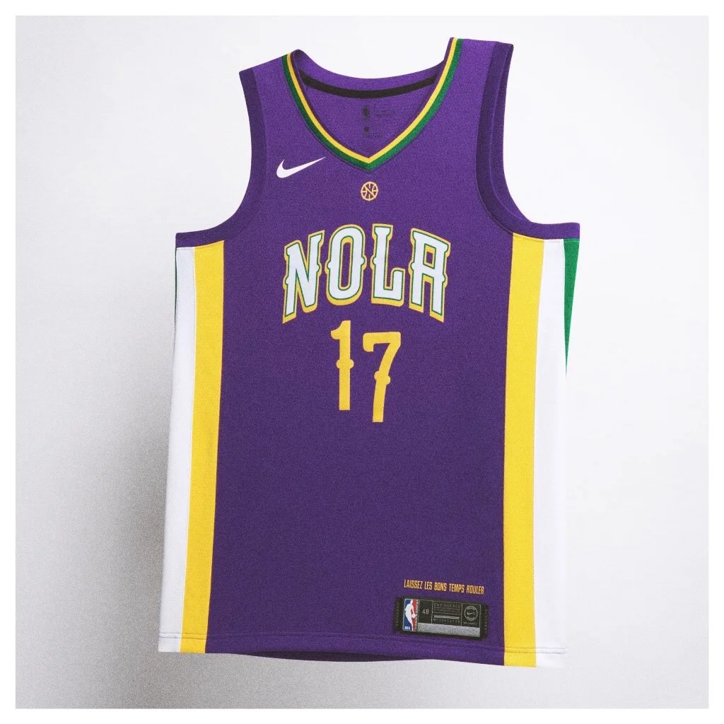
Falc: I really like how the NOLA jerseys grab you. That's a city that's been through a lot, and there's something about the bright colors that instantly draw you in and connect you with not only Mardi Gras, but also the culture of the city and the people. You could take 'NOLA' away from the front of the chest and still be able to make a guess about the city the jersey represents.
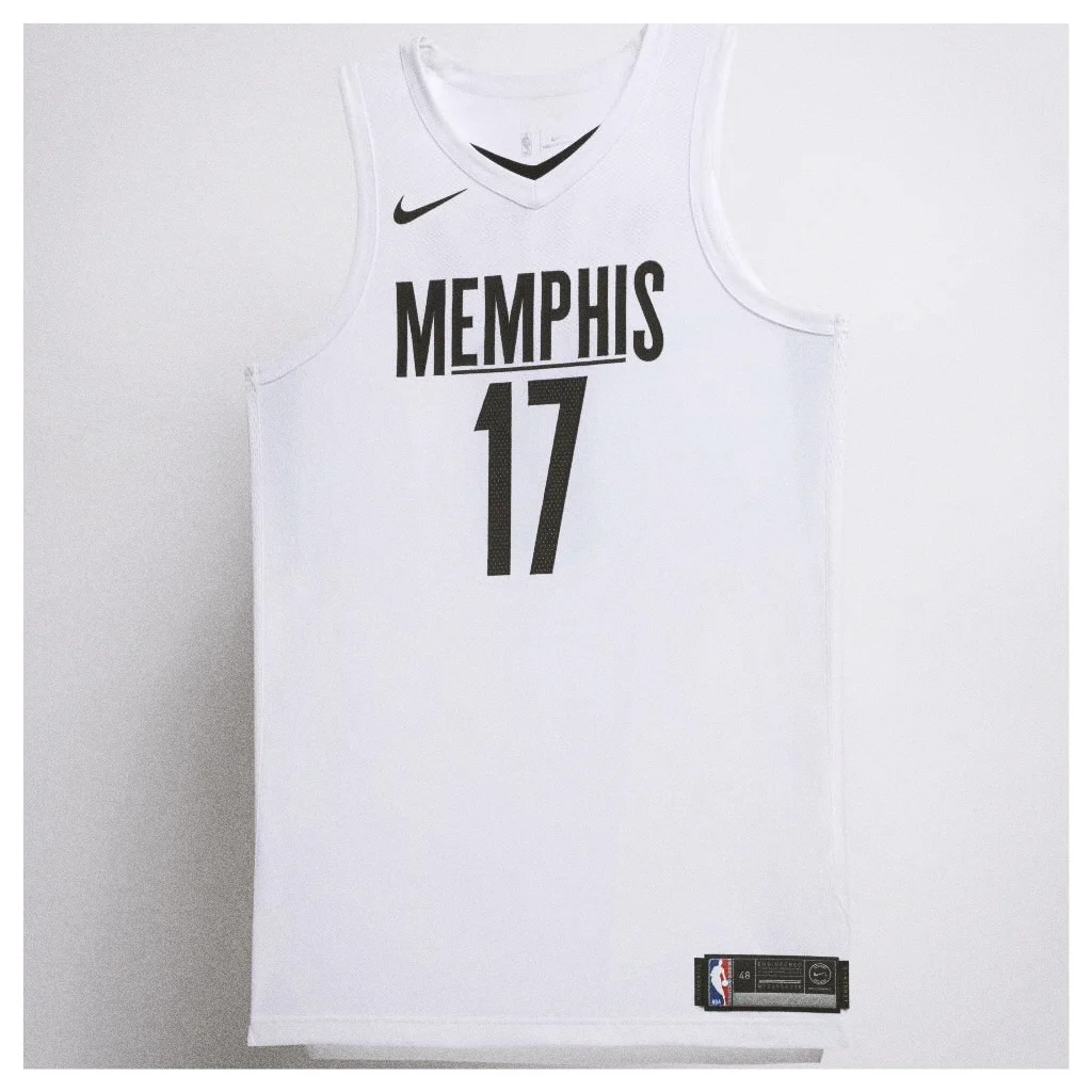
Baro: MEM is an easy winner - their 'City' uniforms pay tribute to Martin Luther King Jr., lend support to remembrance of MLK* in the National Civil Rights Museum & is also inspired by the 1968 Memphis Sanitation Workers Strike.
*50th anniversary of his assassination
1st Jersey to be worn by a player who scores 40 points
Falc: I'm going with Steph Curry. I can see him donning a bright yellow 'the Bay' jersey, sinking three after three upon his return from yet another ankle injury. You heard it here first.
Baro: As much as I'm not feeling Cleveland's new jerseys, I'd put money on LeBron being the first to crack 40. He's a big fan of the jersey design + (most importantly) his first tilt in the new kits is v. the uptempo Houston Rockets.
So look for LeBron to show out when given the chance.
Remember, this is the same guy who won an NBA Finals Game 7 in sleeved jerseys he wasn't fond of.


